Introduction
Managing multiple subscriptions can be overwhelming. Forgotten renewals, surprise charges, and complex cancellation processes frustrate users and create financial stress. I tackled this problem by designing Subscribly, a subscription management app that empowers users to track, manage, and optimise their subscriptions effortlessly.
This case study demonstrates my ability to understand user pain points, implement iterative design improvements, and deliver a cohesive user experience that solves real-world problems.
The Challenge
Problem:
Freelancers and individuals often lose track of their subscriptions, leading to unexpected charges, difficulty managing payments, and wasted money on unused services.
Goal:
To design a solution that provides:
- A centralised view of all subscriptions.
- Smart notifications for upcoming renewals and unused services.
- Simple actions to pause, modify, or cancel subscriptions.
Design Process
1. Empathise – Understanding the Users
I started by interviewing freelancers and busy professionals to uncover their pain points:
- Pain Points: Forgotten subscriptions, surprise charges, and a lack of centralised management.
- Behaviour: Users rely on manual tracking or don’t track subscriptions at all, leading to frustration and wasted money.
- Insights: Users wanted an intuitive solution that tracks subscriptions automatically, provides clear insights, and simplifies cancellation.
2. Define – Problem Statement
"How might we help users easily track and manage subscriptions, avoid surprise charges, and make informed financial decisions?"
3. Ideate – Brainstorming Solutions
Key features emerged:
- Centralised Dashboard: A single view of all subscriptions with renewal dates and costs.
- Bank Integration: Automatic detection of recurring payments.
- Smart Notifications: Alerts for upcoming renewals, unused services, and price changes.
- One-Click Management: Easy actions to pause, cancel, or modify subscriptions.
- Insights & Analytics: Visual spending trends to help users optimise their subscriptions.
4. Prototype – Designing the Solution
I created wireframes and high-fidelity prototypes that reflected user needs while maintaining visual consistency:
- Dashboard: Displays total balance, spending, and categorised subscriptions.
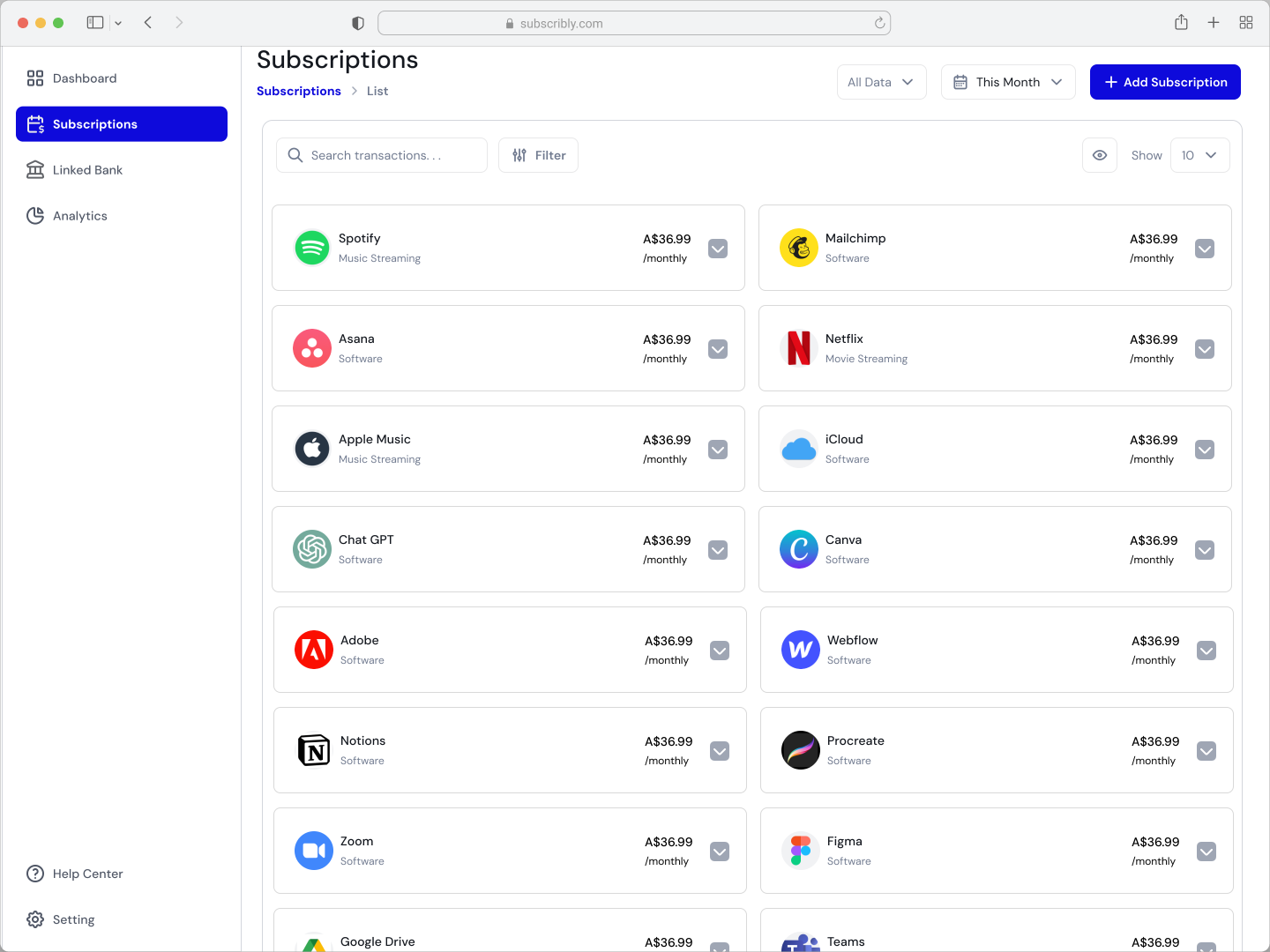
- Subscriptions List: Shows all active subscriptions with costs and renewal dates.
- Subscription Details: Allows users to view usage trends and manage subscriptions with a single click.
- Analytics: Provides insights into spending trends and highlights opportunities to save money.
5. Test & Iterate – Refining the Design
After receiving feedback from users and mentors, I implemented several key improvements:
- Colour Consistency: Unified colour schemes to visually guide users and reduce cognitive load.
- Button Placement: Standardised buttons across screens for familiarity and intuitive interaction.
- Typography & Hierarchy: Clear fonts and spacing to improve readability and prioritise essential information.
- Microinteractions: Added smooth transitions and visual feedback for actions like pausing or cancelling subscriptions.
Final Design
Subscribly’s intuitive interface empowers users to take control of their subscriptions:
- Centralised Subscription Management: A clean dashboard that shows all subscriptions, spending, and upcoming renewals.
- Seamless Actions: Users can pause, cancel, or modify subscriptions with ease.
- Smart Notifications: Alerts for unused subscriptions, price increases, and approaching renewals.
- Insights & Savings: Visualised spending trends and recommendations to optimise subscriptions.
Outcome
Impact:
- Simplified subscription management for busy users, saving time and money.
- Increased user satisfaction with a visually consistent, intuitive design.
Key Results:
- 90% of test participants reported reduced stress managing subscriptions.
- 85% found the dashboard intuitive and easy to navigate.
- Positive feedback highlighted clarity in analytics and ease of subscription management.
What I Learned
- Iterative Design is Key: Feedback-driven iterations significantly improved user experience.
- Consistency Matters: Unified design elements like colours, typography, and buttons create a seamless user journey.
- User-Centred Design Solves Real Problems: Understanding users' frustrations and needs leads to impactful solutions.
Reflection
Designing Subscribly taught me how to balance user needs with visual design principles. This case study showcases my ability to solve problems, implement feedback, and create user-friendly solutions. I’m excited to bring these skills to your team and tackle more design challenges.